


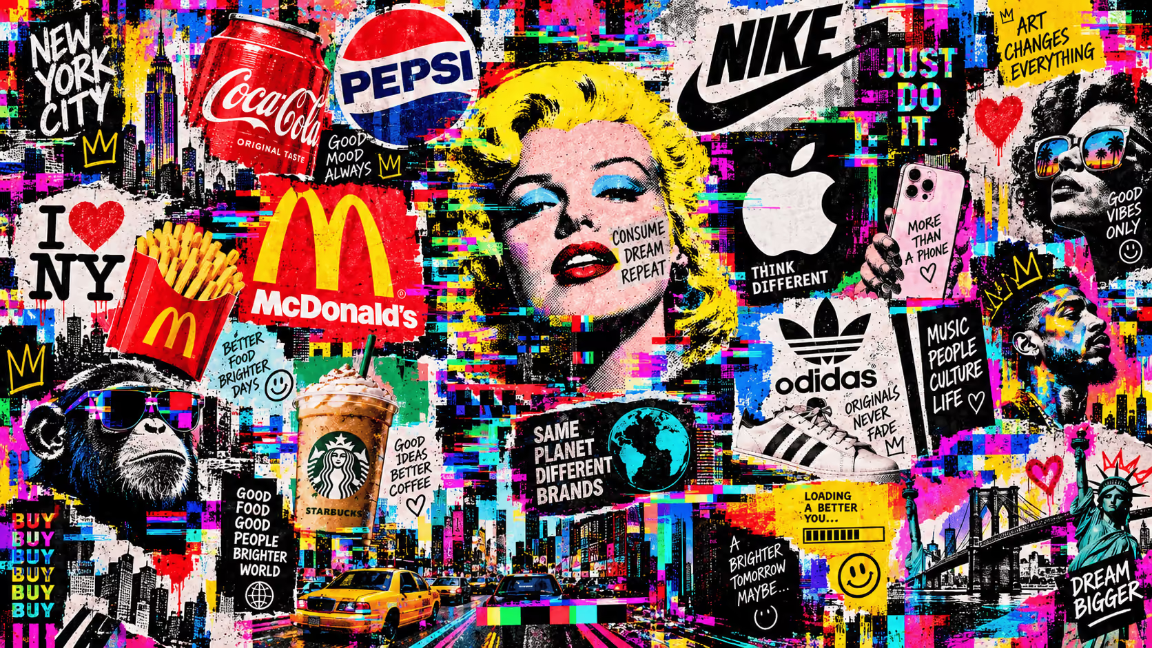
Your logo is the first thing a customer sees and, often, the only thing they remember. There are seven main types of logos: wordmark, lettermark, symbol, combination mark, emblem, mascot, and logo. Each one tells your brand's story in a different way and suits some businesses better than others. Let's look at them one by one, with examples you'll surely recognize.
What is a logo and why are there so many types?
A logo is the graphic sign that identifies a brand and can consist of letters, a symbol, or a combination of both. Strictly speaking, "logotype" refers only to the typographic part, although in everyday language we use "logo" for everything.
There are so many types of logos because each brand solves a different problem: making a long name readable, ensuring it works as a 32-pixel icon, or conveying tradition. At Ocelot, we always start there: before drawing anything, we decide what type of logo the business needs.
Regardless of the type, a good logo meets five requirements: it is legible, scalable, reproducible on any medium, distinguishable from the competition, and easy to remember.
What are the existing types of logos?
1. Wordmark: text only
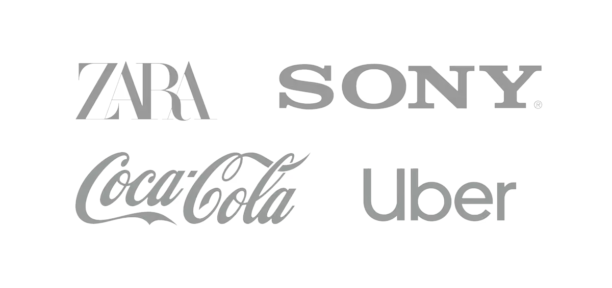
A pure wordmark is the brand name written in a custom or highly crafted typeface, without any drawing. It works great when the name is short and catchy. Coca-Cola, Google, or FedEx are classic examples; the latter even hides an arrow between the E and the x.
Here, the typography does all the work: a serif font conveys seriousness, a sans-serif sounds modern and clean, and a script font adds a personal, artisanal touch.
2. Lettermark: the initials
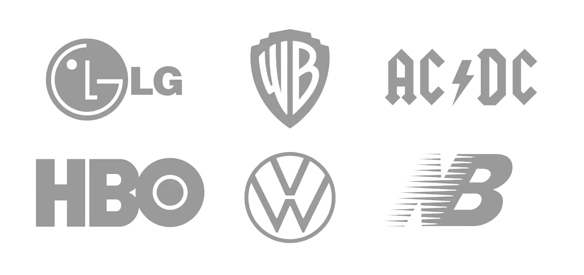
A lettermark reduces the brand name to its initials or acronyms. It is the perfect solution for long or hard-to-pronounce names: IBM stands for International Business Machines and HBO for Home Box Office. Of course, at the beginning, it needs the support of the full name until people associate it.
3. Symbol: the icon without words
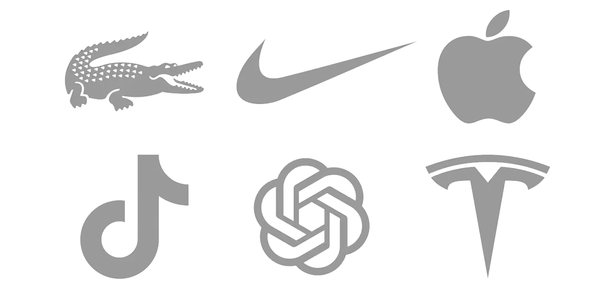
El isotipo es un símbolo que representa a la marca sin necesidad de texto. Puede ser figurativo, como la manzana de Apple, o abstracto, como el swoosh de Nike. Es el tipo más potente y también el más exigente: solo funciona por sí mismo cuando la marca ya es muy conocida, así que para un negocio que empieza suele ser mala idea apostarlo todo a un símbolo.
4. Combination mark: symbol and text living together
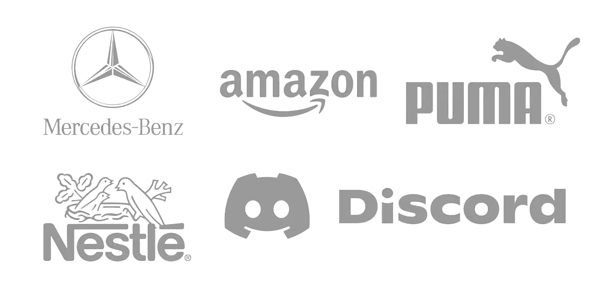
A combination mark pairs an icon and a name, but both elements are separate and can be used on their own. Lacoste with its crocodile or Spotify are good examples. For most SMEs and freelancers, this is the most sensible option: the full version goes on the website and the symbol alone goes on the favicon or social media avatar.
5. Integrated mark: text and image fused
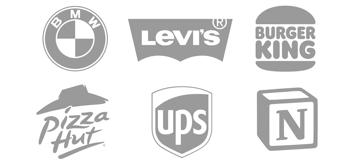
In an integrated mark, text and image form an indivisible piece that cannot be separated. Burger King, with its name between the two halves of the bun, is the textbook example. It has a lot of personality, but loses legibility at small sizes.
6. Emblem: the heritage of crests
The emblem encloses the name within a shape, such as a shield, seal, or badge. It conveys tradition, stability, and belonging, which is why it is common in football clubs, universities, breweries, or brands like Harley-Davidson. Its weak point is detail: on a small screen, it can become a blur.
7. Mascot: a character that puts a face to the brand
The mascot is an illustrated character that gives a face and personality to the brand. The Colonel from KFC or Freddie the monkey from Mailchimp are clear examples. It connects very well with family and young audiences, although it almost always accompanies a simpler logo.
Which type of logo should you choose for your business?
The ideal logo type depends on your name, your industry, and where your brand will be seen. A few quick tips:
- Short and original name: logotype.
- Long or technical name: monogram.
- Brand that lives in apps and social media: imagotype with a symbol that works on its own.
- Business based on craft or tradition: emblem.
- Children's or family audience: mascot as support.
There is one piece of data worth keeping in mind. A study of 597 companies concluded that descriptive logos—those that hint at what the brand does—improve consumer perception and business performance. The exception is for products that the public associates with something unpleasant. For a new brand, having a logo that explains what you do is an advantage.
How can you make your logo work digitally?
A modern logo needs a system of versions, not just a single piece. Ideally, you should have a main version, a horizontal one, a reduced version with the symbol, and positive and negative variants, always in SVG format so it looks sharp on any screen.
At Ocelot, we design websites in Webflow, and that is where you immediately notice if a logo is well thought out: headers, mobile menus, favicons, and social media all require very different sizes.
One last tip to save you trouble: before launching, check that no one else has registered something similar and register it with the OEPM or, if you are going to sell abroad, with the EUIPO.
If your logo has outgrown you or you are not sure which type fits your business, at Ocelot we help you build an identity that works just as well on a billboard as it does on a mobile screen. Write to us and we can look at it together.
Frequently asked questions about logo types
What is the difference between a logotype, isotype, imagotype, and isologo?
A logotype is text only, and an isotype is a symbol only. An imagotype combines both in a separable way, while an isologo fuses them into a single piece that cannot be divided.
What is the most recommended type of logo for an SME?
For most SMEs and freelancers, the imagotype is the most practical option. It allows you to use the full version or just the symbol depending on the available space, which is key for web and social media.
Can a brand change its logo type?
Yes, and it is quite common. Many brands start with an imagotype and, once they gain recognition, they drop the text and keep the symbol, as Nike has done.
Is it mandatory to register a logo?
It is not mandatory, but it is highly recommended. Registering your trademark with the OEPM grants you exclusive rights to use it in Spain and protects you against copies.


